
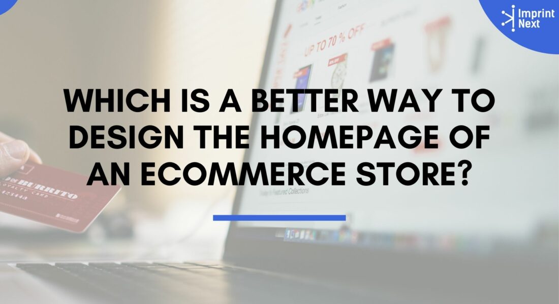
Which is a Better Way to Design the Homepage of an Ecommerce Store?
![]() | 1561 /
| 1561 /
Last Updated on: 7th April 2024, 09:50 pm
It depends upon what you sell in your eCommerce store. Like t-shirts, it is usual to show them in square boxes. If you are trying to create a brand or logo, the whole design itself is better.
Furthermore, if you have funny images or one line, you better inbox them. Therefore, the main reason behind designing is to differentiate yourself from your competition. Ultimately you have to convert visitors into buyers regardless of what design convention you prefer.
Top 6 Tips To Make Ecommerce Homepage Design that Converts:
So let’s just go over all the main elements that your homepage needs starting from the top down first.
1. Clear navigation:
It one is probably the most obvious on the list and that’s visible navigation.
Want to Boost Your Print Shop Revenue?
Schedule a free consultation
So ideally on a home page or any kind of landing page, you want to be able to tell a structured story from the top to the bottom but every person that comes to your site is going to be a little different meaning.
They’re going to have different things that interest them the most so some people may be most interested in pricing.
Some people might be interested in reading testimonials or faqs.

Do you have printers? Are those printers sitting idle?
Become a Print-on-Demand dropshipping app like Printful or Printify. Dropship your merchants' orders.
Unlimited Merchant stores. Dropship and Fulfil Merchants' orders. Manage merchant invoice, sales commission, etc. Merchants sell the designed products in shopify, etsy stores, etc.
Know moreSo the more you can make that information instantly accessible the better chance you’re going to have of connecting with everybody.
So make sure it’s right at the top where it’s supposed to be and always visible.
Also read: How to Create a User-friendly Website?
2. Strong hero section:
Next, you want a strong hero section.
It should include a strong headline, a sub-header that gives even more explanation, and an image that visually represents the written text.
So the goal here is just to make it 100% clear exactly what you do within three seconds.
If you want to use no industry jargon whatsoever using technical language may show off your expertise.
Boston based custom slide sandal maker has become $10 Million company using an online designer and unique growth marketing.
Read moreBut it does absolutely nothing to connect with your customers and it ends up often coming off way more about you than them.
So it’s best to avoid it now. The big trend here used to be using an image slider with rotating images and headlines to accompany them.
A lot of studies in the past few years all said the same thing that these are just bad for conversions.
So you’re better off just sticking with one image and one strong headline and message okay next you’re gonna want to call out the benefits of what you offer.
3. Homepage Trap:
Now a big homepage trap. We see a lot of businesses fall into they want to go right into the features that people will get with their service or product.
But instead of talking right away about what your customer is going to get you want to start communicating about what they’re going to get out of it.
In other words, the benefits they get from the features think of this simply as the perks they get from working with you.
What we usually like to do is come up with three main benefits distill them down to three and then just put in a simple three-column layout name the benefit gives a short description and uses an icon or an image to make it very visually clear at a glance.
Remember most people don’t so much a reader page as they skim it so visual cues are really important.
So we’ve covered the benefits which satisfy that emotional part of a buyer and remember most buyer behavior is actually motivated by emotion and only after they’ve decided on a product.
To some degree, they decide to back that decision up with logic.
Also read: How can I optimize a startup eCommerce website
4. Include a feature section:
So next we’re gonna play into that logic part of the brain and now it’s time to talk about the features. It includes a little features section that shows exactly what they’re gonna get.
You can put this into a simple bulleted list. Just list out what’s included rather than list out every single thing which may be overwhelming for the average viewer.
You limit it to maybe ten or so bullet points.
Also read: How Can I Make Product Images Look Clear and Professional?
5. Add Social Proof:
Next is very important and that is social proof.
So we live in a world that’s pretty much run by reviews and testimonials.
It is pretty rare these days to ever buy anything online or go to a restaurant or even go to a movie without reading a few reviews about it.
First, right well your website is no different so you’re gonna need this on your home page as well if you’re a service business include a few testimonials, or if you sell a product you’re going to want to have a few product reviews right there on your homepage.
Rather than just writing the text you’re going to want to include a real photo of the reviewer just to help it connect much more.
People are more likely to believe it as being true.
If they can see the face attached to it I know it came from a real person that recommends it. Thus, going one step further with this and getting at least one video testimonial or product review, just connects much more powerfully than written text.
Another way to use social proof to your advantage is through a plugin.
It works great if your main call to action is to schedule an appointment or a consultation or to download a free piece of content. All you have to do is set it up and track every time someone completes that desired action then it captures it and displays it to other visitors.
It shows people that others are taking action which studies
6. Call To Action:
The next point is your primary call to action.
In other words, you want your site visitors to do your site do you want them to call you to book a consultation to buy an actual product?
Whatever that action is you want to make it ridiculously easy for them to do it.
So put it in a prominent location and style it as a button the button should stand out from all other page elements.
It is better to not use the same button color anywhere else on the site you can display it in multiple keys on the page such as at the bottom of each section.
Make it constantly visible in a sticky navigation bar that stays at the top of the browser as you scroll down the page.
So that’s your primary call to action.
You can also use a secondary call to action that’s designed purely to get those other 80 to 90% of people onto your email list.
Once they’re on that you can stay in front of them sending periodic emails to them over time.
It takes for them to decide if they want to work with you or one of your competitors.
Final Words:
So the first thing you’re going to want to do is to decide on a lead magnet idea.
You want to include a dedicated section to it lower down on your homepage. It should just be a really simple form encouraging them to give you their name, email, address possibly phone number in exchange for that lead magnet a
Moreover, take a step further and include an exit intent pop-up which gives people one last chance to opt-in when the browser can detect that someone’s mousing back up toward the back button.
Moreover, keep things visual with large images that illustrate. The main concepts or at least enhance the feeling that you want people to associate with your brand.
Generally, speaking images of people resonate best if it makes sense for your particular site.
But be careful to stay away from obvious stock images people hate those
So just choose them very carefully icons are great to emphasize benefits and features so be sure to use icons whenever you can
Furthermore, use plenty of white space use short sentences, and short paragraphs bullet lists. Whenever possible use headlines. Or whenever there’s an important point or an important phrase.
You want to make sure people see use bold it just really helps to break things up. Moreover, it makes the page much more skimmable which again is how you know aided eighty to ninety percent of people are going to consume your homepage.
Related Questions:
What is an eCommerce homepage?
The ecommerce homepage is the main page of a website that gets the highest traffic compared to other single pages.
What makes an eCommerce website successful?
An ecommerce website becomes successful when it focuses on customer goals like easy shopping, seamless customer experience, and a secured payment system.
Do you have printers? Are those printers sitting idle?
Become a Print-on-Demand dropshipping app like Printful or Printify. Dropship your merchants' orders.
Know moreMost Popular
-
 How To Start A Clothing Line Business Of Your Own?
 - How Much Should You Price Your Embroidery Work?
- Top 20 Wholesale Blank T-shirt Suppliers in USA
- Top 10 DTG Printers in 2024 with Price for Print Business
- 7 Licenses and Permits Required to Start a Clothing Line Business in USA
- 50 Most Creative T Shirt Design as Inspiration for Your Next Tee!


